Very Peri
Encompassing the qualities of the blues, yet at the same time possessing a violet-red undertone, the Pantone color of the year for 2022 is PANTONE 17-3938 Very Peri which displays a spritely, joyous attitude and dynamic presence that encourages courageous creativity and imaginative expression.
Displaying a carefree confidence and a daring curiosity that animates our creative spirit, inquisitive and intriguing PANTONE 17-3938 Very Peri helps us to embrace this altered landscape of possibilities, opening us up to a new vision as we rewrite our lives. Rekindling gratitude for some of the qualities that blue represents complemented by a new perspective that resonates today, PANTONE 17-3938 Very Peri places the future ahead in a new light.
— Pantone

We brought in our RNDD Designers and Showrooms to provide us with some design tips on how you can incorporate this dynamic color into your own home interior design.
Pair Very Peri with a Contrasting Color
While the design community is looking for ways to incorporate Very Peri, Pantone’s 2022 Color of the year, into their home design projects, Gessi offers a faucet finish that works exceptionally well to pair with this bold color. Virtually opposite on the color wheel – the Gessi Brushed and Polished Brass finishes offer great contrast against a vanity, sink, wall or even a tub in the Very Peri purple color. From a design perspective, these brass fixtures from Gessi pop against the purple hue creating an interesting contrast that is both modern and dramatic. Gessi demonstrates the beauty of these finishes on their new Venti20 – a collection that captures the aesthetical spirit of the “Roaring Twenties” and reimagines it for the modern world. Elegant lines pair with meticulous detailing with fluted bodies, reflective cuts, all combined in a singular silhouette!


Liven Up a Room with Art
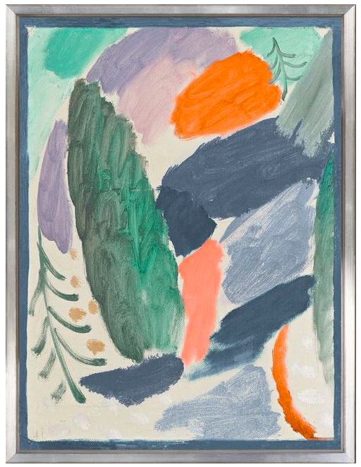
The Pantone of the year, Very Peri has an important meaning and represents a great deal for this year. It can be very spirited in the design world. The calmness of the blue, combined with the intensity of the violet, and the red undertones can make a big impact when it comes to interior design. A great way to use this courageous color is through the art you decorate your home with. These two pieces by artist JD Miller (Purple Evening & Orbital Descent), represented by Samuel Lynne Galleries, embodies the meaning and energy this color represents. Art is the ideal way to bring adventurous colors into your home that can truly transform a room.


Customize Your Bathroom Vanity with Color
The bathroom is the room in your home where you start and end your days. So why not spend a little extra time making your bathroom a beautiful oasis? ORIZZONTI, a LACAVA galleria, can customize and finish any vanity in the color of your choosing, including the Pantone color of 2022, Very Peri. They can color match any Sherwin Williams or Benjamin Moore color. A customized vanity in a bold color could be just the thing your bathroom design needs.

Think: Small Space, Big Color
In line with JC Licht’s 2022 design trend, they see bold colors like Pantone’s Color of the Year, “Very Peri,” being used to create drama and interest. When considering implementing strong colors in the home, think “Small Space, Big Color.” Using a bold color such as Very Peri in a powder room or coat closet produces a “jewel box” affect and adds an unexpected surprise to your home design. Don’t stop at paint! Create a feature wall using wallpaper and exciting pieces of hangable decor or artwork. While selecting your wallpaper, try to find patterns that incorporate your paint color to give the space character that is creative while still feeling cohesive.
Designer Pro Tip: If uncertain about choosing an eye-catching but very saturated color, focus on areas of the house that are not often used, like the dining room, powder room or mud room as you will never tire of your choice.


Add Splashes of Color with Wall Decor
Casa Bella suggests the best way to add a touch of Very Peri or other periwinkle tones into your home design, is through original wall decor from Celadon Art. Use the Pantone color of the year to give your walls the refresh they need, just in time for Spring.


Subtle, Yet Bold Use of Very Peri in the Kitchen
The eagerly awaited announcement of Pantone’s 2022 Color of the Year turned extra intriguing when it was discovered that this violet-blue hue is Pantone’s own creation. The eggersmann design team is already on board having designed a stunning kitchen featuring none other than the Very Peri chroma. The minimal kitchen is literally a jewel box featuring a hexagonal tiered islands topped with semi-precious stone, amethyst. The stunning countertop stands out among the white and metallic gray cabinets juxtaposed with the warmth of walnut.


Balance Very Peri with a Softer Color Palette
Very Peri is a youthful, carefree and confident color that brings forth a creative spirit. To use Very Peri in your home interior design, Sarah Jacquelyn Interiors suggests that you balance this intense, vibrant color with a pastel blush or lilac or with accents of a sage green. This is a great option for a living room or family room in particular. Alternatively, go bright and bold with a combination of bright greens to offset the vibrant peri. This is a great color palette for a sunroom!

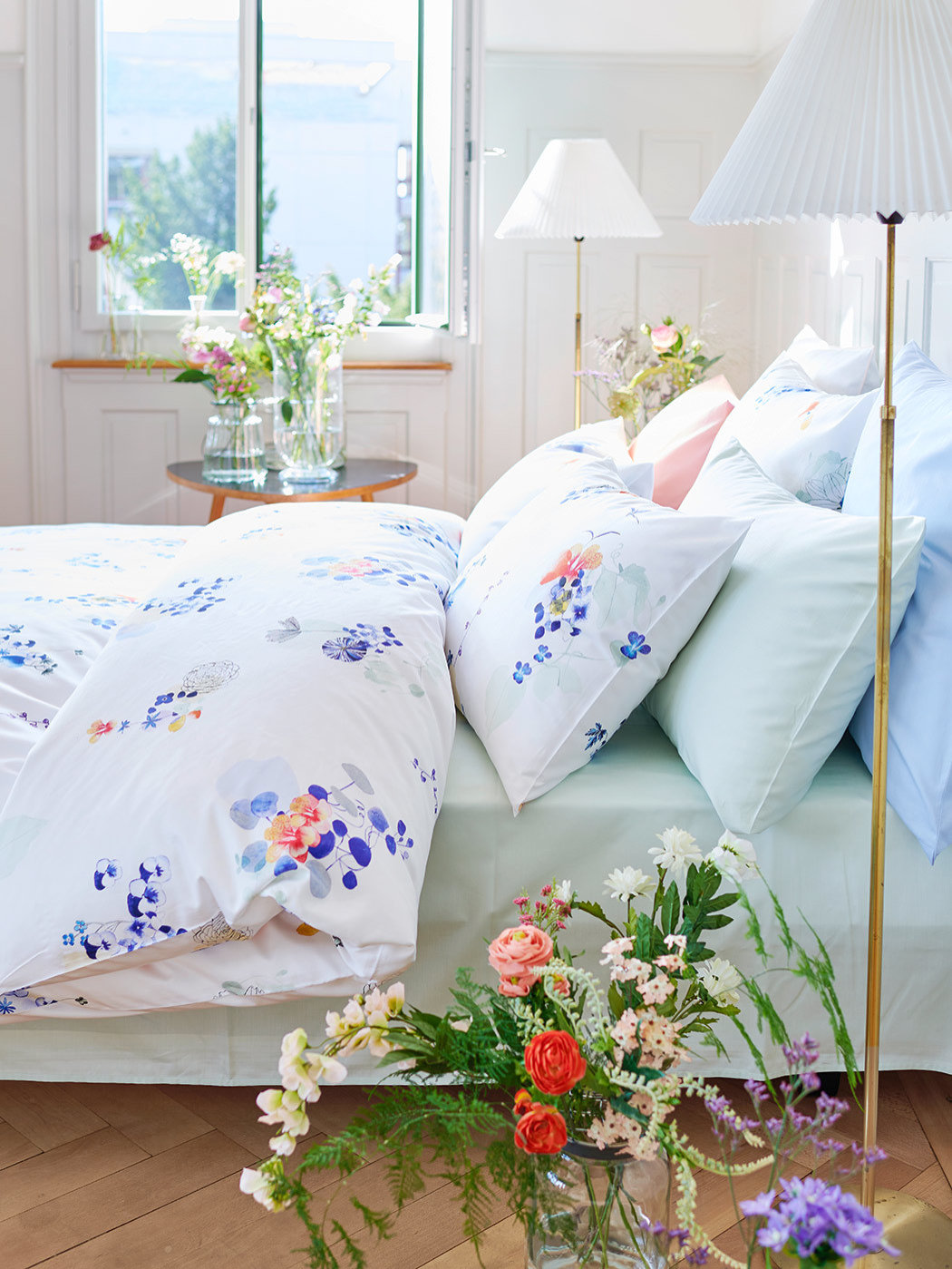
Bring in a Pop of Peri with your Bed Linens
Christian Fischbacher Viola Linens, available through The Luxury Bed Collection, provide a pop of the futuristic Veri Peri hue with a comfortable floral motive pattern. The soft watercolor-like transitions and transparent overlays are especially beautiful providing an empowering mix of newness – exactly what you need for 2022.